
When it comes to designing for the Ed Tech space, there's a lot at stake. From visual identity and marketing design to the UI/UX of the most edge-case interaction within the product itself, design decisions need to inspire engagement, support usability, and strengthen trust in not only the product, but also in the company behind it.
CredEd is an Ed Tech startup empowering the upskilling & mobility of the education workforce through portable, globally recognized credentials. We partnered with CredEd to design and build their product platform, visual identity, and marketing website. The opportunity to simultaneously develop virtually their entire funnel was a welcome one. It meant that we could plan and execute holistically, designing for the flexibility that a modern brand wants and the continuity that a successful digital product needs.
We began our design work with a visual identity. We knew that it had to accomplish four things:
- to make visual sense for the product
- to differentiate CredEd from other companies in the space
- to be flexible and adaptable enough to accommodate growth, shifts, pivots, etc.
- to form the crux of a flexible design system that could be implemented over a range of applications.
We did our homework—looked at the product roadmap, the user scenarios, the market, and the competition. We brainstormed, sketched, and refined until the visual identity system we arrived at nicely solved for the first two items on our checklist. But since even the most thoroughly researched and rationalized aesthetic decisions will never escape the realm of subjectivity, let's look beyond those aesthetic points toward two equally important aspects of our work for CredEd — continuity and flexibility.
![]()
Flexibility
The consumer/brand relationship has evolved alongside the growing number of channels and applications through which a brand is experienced. Many of the best brand identities are built on the premise that a modular and flexible identity system provides the best, most agile platform to deliver a brand—particularly in an environment increasingly beyond the purview and control of traditional brand guides and guardians.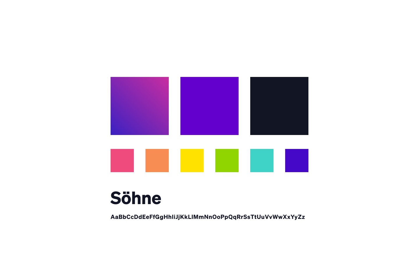
Knowing that CredEd is an early-stage startup with intentions of large-scale global adoption, we also wanted to ensure that the visual identity had the flexibility to grow, shift, and adapt along with the company itself.
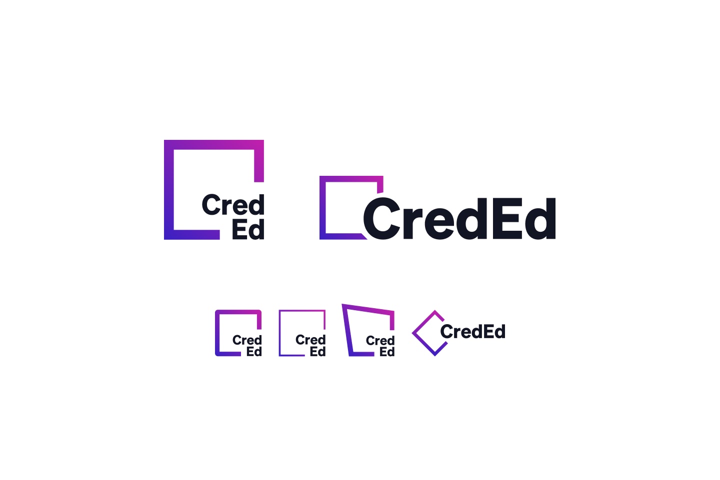
We built the logo around the interplay between two basic elements—a sturdy, neutral sans serif typeface, and a rectangle. These two basic structural elements are intended to be fluid in size, shape, proportion and relationship. Currently, we've developed two lockups for situational placement—one square and one horizontal. However, as the needs of the brand evolve, the permutations of these two elements—both in tandem and independently—can easily grow.
The elements themselves, as well as the interplay between them, can easily shift to accommodate unanticipated needs. Thinner lines, softer edges, a different shape or typeface altogether. These are all changes that can be implemented as evolutions without fundamentally changing the identity's essence.
The color palette, based on a violet-to-fuchsia gradient, is bright and bold. It's also a secondary aspect of the visual identity.
Continuity
When you're working in an agile environment to spin up a brand, a product, and marketing collateral simultaneously, it can be challenging to not lose sight of the bigger picture. Even with endless time and resources, many companies fail to maintain continuity from brand to marketing to product, whether due to siloed departments, unaligned priorities, differences in management, or other factors. This can be particularly true of the transition from a marketing site to a product.
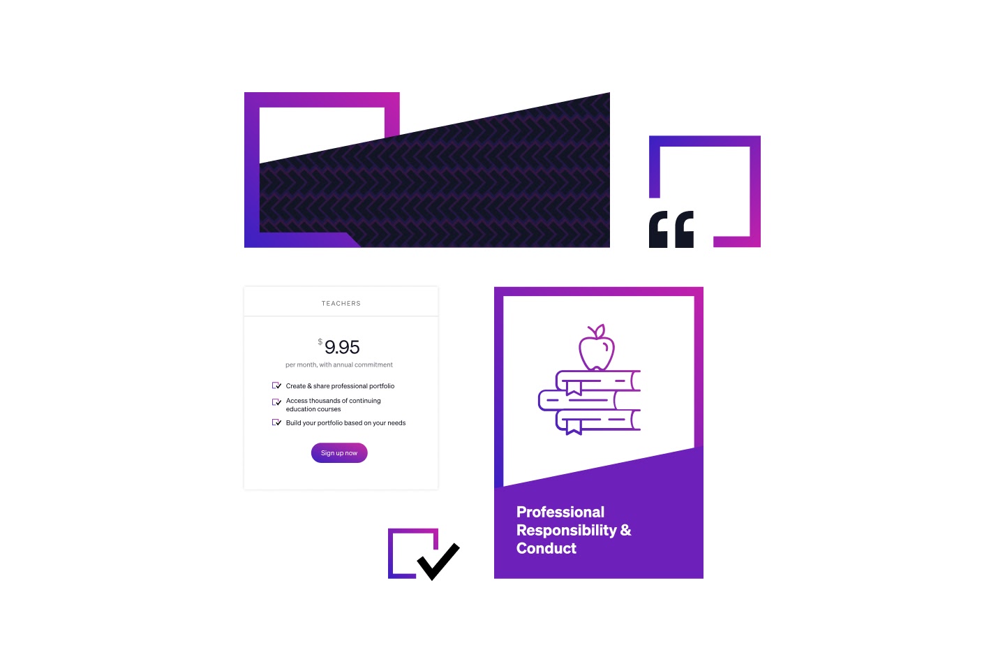
Drawing on our experience in all three areas, we capitalized on the opportunity to provide an end-to-end experience for CredEd. Once we had the foundation of our visual identity drafted and approved, we began work on the marketing site, sign-up experience, and product simultaneously. We abstracted elements from the logo to reuse as UI elements in our layouts—from checkboxes and quotation marks to decorative patterns, badges, and the degree of the angle delineating sections.
At no point during the experience does a user feel disoriented or as though they've left one experience for another altogether. That level of continuity and seamlessness goes a long way toward creating an intuitive and trustworthy user experience. Which, in turn, goes a long way toward creating product traction and inspiring brand confidence.
Looking Ahead
As CredEd positions itself to improve the upskilling experience for teachers, we're excited to see how far their new visual identity and design system will take them. But we're even more excited by the prospect of continuing to work with them to grow, refine, and adapt the system that we've established to be able handle whatever comes next.
Research & Design is a design and technology company. We direct our focus to tackling problems within education—working with colleges, universities, and companies serving higher-education institutions—to solve problems through digital communication.
At our core, we are focused on solving problems through clear, concise websites, applications, campaigns, and digital communication. We believe in design as a way of thinking and problem-solving that can be applied to almost any challenge.