How to Evaluate Web Accessibility In Education
 From marketing to online education, educators need to consider their website’s accessibility experience for everyone. While the number of students with disabilities or impairments has grown over the past few years, it brings a challenge to schools and universities when designing an accessible online experience for everyone. While campuses design physical spaces to comply with accessibility requirements, accessibility for their website has not been a priority. As websites are becoming more vital to education, the laws governing access need to be taken seriously. So, what steps can be taken to meet the Web Content Accessibility Guidelines (WCAG)?
“Accessible design is how easily people can use your website. Specifically, it focuses on people that have disabilities that impede their vision, hearing, and movement. As designers, we should strive to create inclusive websites that are easy to navigate and easy to understand for everyone.”
Nicholas Kramer
A Primer to Web Accessibility for Designers
Evaluating Accessibility
Whether you’re needing to evaluate a current site or starting a new project, there are some helpful resources available to help you understand and meet accessibility standards. The first step is to make sure you have a good list of what you should check.
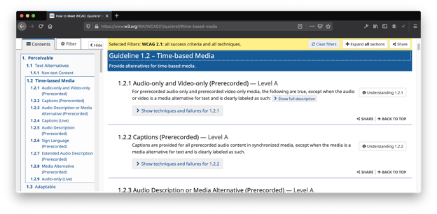
The Web Accessibility Initiative (WAI), a part of the World Wide Web Consortium (W3C), provides an overview and quick reference on how to meet the Web Content Accessibility Guidelines (WCAG). Each guideline provides descriptions and what level (A, AA, AAA) it meets. Level AA is the target compliance level to meet the requirements of the Americans with Disabilities Act (ADA). The techniques and failures for each guideline provide examples to help you find solutions to any accessibility errors or alerts.
The World Wide Web Consortium’s (W3C) Web Content Accessibility Guidelines (WCAG) 2.0 AA are widely accepted as providing for full and equal access in accordance with federal law.
National Federation of the Blind
The four main principles of accessibility, summarized in WCAG, you should continually ask about your design are:
- Is it Perceivable? Information and user interface components must be presentable to users in ways they can perceive.
- Example: Is closed captioning provided for videos?
- Is it Operable? User interface components and navigation must be operable.
- Example: Can a user navigate only using a keyboard?
- Is it Understandable? Make text content readable and understandable.
- Example: Are you avoiding the use of jargon?
- Is it Robust? The content of your website can be interpreted by a wide variety of user devices, including assistive technologies.
- Example: Can a screen reader interpret your content?
Accessibility Checklists
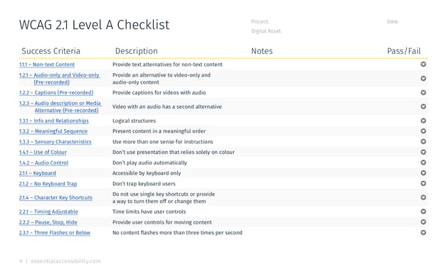
To help you in assessing accessibility, it’s best to develop a checklist for your team’s documentation. You can create your own document, but there are WCAG templates developed by Essential Accessibility and The A11Y (Accessibility) Project you can use right away.
A more robust checklist is the Voluntary Product Accessibility Template (VPAT) you can download for free, provided by the Information Technology Industry Council (ITIC). There are different VPAT documents, based on what you're testing and what guidelines your product requires. When testing our websites, we use the VPAT with the Web Content Accessibility Guideline (WCAG) guidelines. Level Access has a webinar on how to complete the VPAT documentation.
What’s the difference between WCAG 2.0 and WCAG 2.1 Guidelines?
You may notice there are times you see WCAG 2.0 or WCAG 2.1. Basically, WCAG 2.1 is an update on guidelines for three areas:
- users with cognitive or learning disabilities,
- users with low vision,
- and users with disabilities on mobile devices.
So, if you’re just starting out, WCAG 2.1 contains the guidelines you’ll want to follow. However, if you’ve done testing in the past and met WCAG 2.0 guidelines, there are some new features you’ll need to review.
“WCAG 2.1 builds on and is backwards compatible with WCAG 2.0, meaning web pages that conform to WCAG 2.1 also conform to WCAG 2.0. Authors that are required by policy to conform with WCAG 2.0 will be able to update content to WCAG 2.1.”
Web Content Accessibility Guidelines (WCAG) 2.1
Comparison with WCAG 2.0
Accessibility Toolbox
Okay, now that you have a checklist of items to assess, you’ll need a set of tools to help you test. These tools can range from browser plugins, to websites, to pre-installed software and are normally based on the Web Content Accessibility Guidelines (WCAG) for Level A and AA. We’ll identify if the tool evaluates to WCAG 2.1 or WCAG 2.0 guidelines.
Evaluation Tools
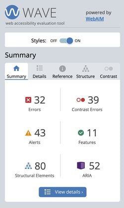
WAVE is a website accessibility WCAG 2.1 evaluation tool, developed by Web Accessibility In Mind (WebAim). You can use the website’s search form or install the WAVE extension onto your Firefox or Chrome browser. WAVE’s feedback is meant to help facilitate your evaluation and identify many accessibility and Web Content Accessibility Guideline (WCAG) errors. The delivery of the assessment provides information about why an item is important to correct and potential solutions to address the problem.
While WAVE is often the first tool we use, it’s not the only evaluation tool using WCAG 2.1 guidelines, there are other extensions for both Chrome and Firefox:
- ARC Toolkit (Chrome Extension).
- Siteimprove Accessibility Checker (Chrome Extension).
- Totally Automated Accessibility Scanner (Firefox Extension).
To test multiple pages, verus one page at a time, the Functional Accessibility Evaluator is a wonderful open-source tool developed by the University of Illinois. It also creates a summary report of its findings. However, it’s still based on the WCAG 2.0 Level A and AA requirements.
Manual Evaluation
While evaluation tools are helpful to get started, a more daunting challenge is simulating how folks who are blind or visually impaired experience your site using screen readers. This is where you need to use your site with only your keyboard and with your eyes closed. Without the use of software to help, it would be impossible to process the information on your site. While it might not be in the budget to have one of the more sophisticated screen readers, designers can test their sites using one of many screen reader options available for free. Usability Geek has compiled a list of software and plugins you can choose from.
ASIDE
We often use the VoiceOver utility built into Apple's operating system. It takes some getting used to. The Google Chrome Developer’s YouTube channel has a helpful video tutorial on the basics of using VoiceOver.
There are a couple of articles on using VoiceOver we’ve found helpful in getting started:
- Using VoiceOver to Evaluate Web Accessibility at WebAim.
- Designing for accessibility by using Apple VoiceOver by Nazli Kaya at UX Collective
In addition to testing how your site works with a screen reader, consider testing other visual disabilities like color blindness, dyslexia, and myopia. Silktide (Chrome Extension) is another useful browser plugin to help with these simulations. To simulate color blindness, Color Oracle is also available for Mac, Windows, and Linux.
Additional plugins to help aid in testing color on your site to help you meet the standards of Web Content Accessibility Guidelines requirements:
- WCAG Color Contrast Checker (Chrome Extension and Firefox Extension ) - WCAG 2.1.
- Accessible Color Picker (Chrome Extension) - WCAG 2.0.
Make a statement
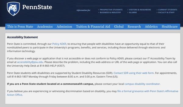
After testing your design and working through the checklist, develop a page with your accessibility commitment statement. This statement informs users that you’re committed to providing accessible services on your website. The statement should provide users:
- An outline of how you meet WCAG guidelines,
- where you’re still improving,
- and how users can provide feedback.
Ireland’s National Disability Authority (NADA) has an Accessibility Statement Template you can begin with with and add to over time. Add an easily accessible link visitors to your site can get to at any time.
Let the Process Begin
As with any process, with time and testing, you’ll find what works best for your team. To successfully weave it into your process, identify the person who will be your accessibility champion. As they infuse accessibility into the process, it will help your team become excited about designing a more delightful and less frustrating experience for everyone.
Research & Design works with colleges & universities to design and engineer websites and learning experiences. Contact us for an accessibility consultation of your website and digital products.
Learn More about Accessibility
- ADA Compliance for College Universities
- Higher Education Accessibility Online Resources
- Feds Prod Universities to Address Website Accessibility Complaints
- Webinar: Where Accessibility Lives: Incorporating A11y into Your Process and Team
- 7 Things Every Designer Needs to Know about Accessibility
- Designing for Accessibility is not That Hard
- A Primer to Web Accessibility for Designers
- Design is the Rending of Intent
- The A11Y Project - A community-driven effort to make web accessibility easier.
- YouTube Playlist: A11ycasts with Rob Dodson

