
It’s 2020 and “above-the-fold” debates in the design world have not gone away. They probably never will, and that’s fine. Let people continue to ask the wrong questions, fret over the wrong concerns, and argue the wrong angles. We’re inviting you to the right fold conversation to be having, in 2020, for your college or university homepage.
Does it Exist?
It’s not the best analogy, but sure—let’s say the fold exists. Although it’s more like a multitude of folds. One for every device, with additional permutations based on layout orientation and preferred zoom settings.
But here’s the thing. Existence or not, it doesn’t matter. When questions or concerns arise regarding the fold, they’re really about another issue—scrolling.
Do Users Scroll?
Yes. They do. Always.
If there’s one thing the shift towards mobile devices, social media platforms, and dwindling attention spans has done for your site’s visitors, it’s trained them to scroll.
Scrolling is a passive user interaction. It requires no commitment and very little physical effort. And it’s often driven by a considered pace—usually defined by whitespace, typographical choices, and the inclusion of visual media—designed to enhance scannability, focus, and comprehension.
So if the fold doesn’t matter and users will scroll, then what should happen on that first screen of a college or university website? Examining what shouldn’t happen above the fold is a great place to start.
Don’t Cram
The top half of a folded newspaper follows a simple two-part strategy for engaging potential readers: 1) our content is worthwhile; 2) here’s a taste—there’s plenty more inside.
With print news, the form this strategy takes tends to be dense and top-heavy. It has to be, given the amount of content published daily and the cost of printing, and the fact that a series of active commitments are required to engage a prospective reader. But it hardly makes for an ideal reading experience.
–––
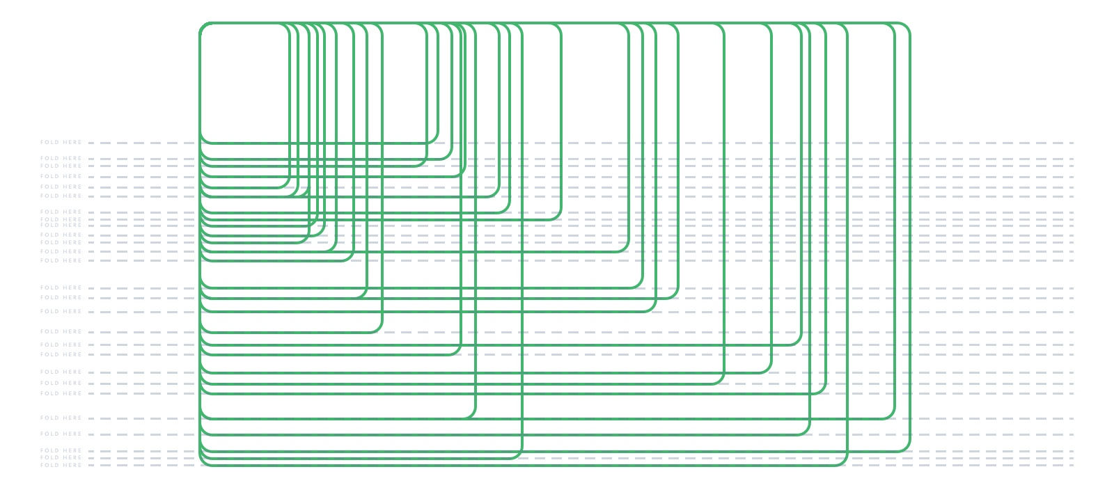
There’s a lot going on above this fold. Users are left with 23 possible actions to take (not including the main navigation) spread out over 7 sections that offer very few visual or layout cues as to the intended hierarchy of content.
–––
Cramming is usually the result of internal politics or scroll anxiety. But if anxiety and politics are the drivers, then strategy is being taken for a ride. Cramming too much above the fold on your website undermines the user experience. It leads to poor design decisions and muddled content strategies, reducing meaningful engagement both above and below the fold. And it often ends up minimizing the impact of the very pixels it seeks to maximize.
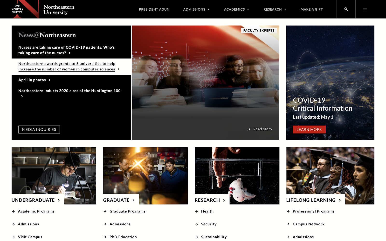
Get Off the Carousel
Carousels—also known as sliders—are often employed above the fold to ease scrolling anxiety and satisfy commitments to internal stakeholders. But carousels are not an effective way to get more content in front of users. Quite the opposite is true.
Carousels require one of two things for a user to engage with their content: 1) waiting, or 2) clicking. Since users (really) do scroll, and often do so within seconds of landing on a page, they’ll be long gone by the time a carousel auto-advances to its subsequent frames. And while clicking is a basic function of the internet and should itself be destigmatized, it still requires user commitment. Which requires a certain amount of cognitive load. Which is a limited resource that sites should try to preserve, not deplete.
So unless you want to mentally tax your users, or you have content you want them to miss entirely, don’t use a carousel. What should you do?
Strategize
There is no single correct strategy for what a college or university should lead with on its homepage. But just having a strategy at all will pay dividends. Honest conversations and trust between engaged outside agencies and internal marketing teams, leadership and other stakeholders will help ensure that the best strategy is chosen for your particular institution. And user testing, as well as tracking site analytics post-launch, will help validate and refine (as necessary) the strategy and its execution.
Consider your differentiators. Consider your audience. Consider your goals. And (honestly) consider your brand recognition.
If yours is a large research university, leading with some of your most recent and/or best research stories might be a better approach than a full-screen drone video of campus.
–––
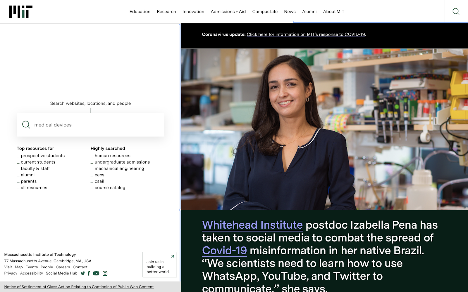
An unconventional layout with an emphasis on highlighting timely research makes perfect sense for MIT. This approach offers users both focused functionality and open-ended exploration, which is the right combo for their target audience.
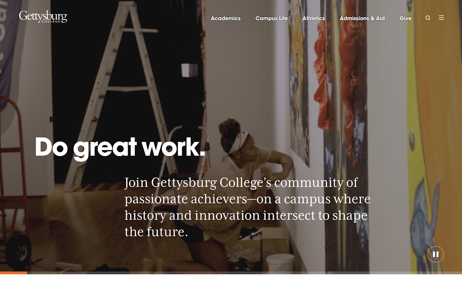 Simple, focused, and action-less. Inspirational language and B-roll footage that captures the breadth and essence of your institution can provide a first impression that quietly piques interest and invites users to continue exploring.
–––
Conversely, a smaller liberal arts college might lack the captivating stories or large content team to support a publishing-heavy approach. Instead, more evergreen content—like nicely shot B-roll footage and some smart marketing language—might be the best way to grab a prospective student’s attention and set the tone for the rest of the page.
Encourage and Reward Scrolling
No matter what direction you take above the fold, your users will scroll. Many of them will scroll even before they’ve fully taken in that first screen. So encouraging and rewarding scrolling is perhaps the most important thing that your above-the-fold strategy can do.
Encouraging users to scroll should come from a confluence of factors. Whether it’s a background video, an impactful story, or a more unique strategy, the quality of both content and design matter, as do build factors like page load time and micro-interactions. The impression made above the fold will set an expectation for what’s to come.
More practical design and development techniques can further encourage users to scroll. “Scroll” text and bopping down-arrows are an easy way to reinforce scrolling. An equally effective and far more elegant solution involves vertically flexing layouts so that some content is always being cut off by the fold. This visual indication of incompleteness sends users scrolling without the need to clutter your design with extra elements.
Now that you’ve got your users scrolling, don’t disappoint them. Carefully plan the hierarchy, content strategy and design of every section on your homepage. Viewer engagement has a convex shape in relation to scroll depth. The more interesting, focused and well-paced the page is, the longer you’ll hold a user’s attention, and the more opportunities you’ll have to engage them in exploring more meaningful and targeted content deeper in your site.
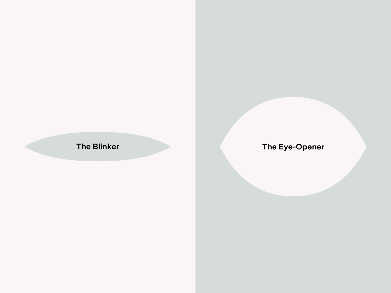
Which would you prefer your homepage to be?
–––
Find Your Fold Zen
Accept that the multitude of digital folds creates an arbitrary target. Trust that users will scroll. Know that content cramming and carousels will work against you.
Allow yourself to become unburdened by these influences and you will be free to put forth the best strategy, content and design to deliver prospects from above the fold of your website into the fold of your student body.
Research & Design works with colleges & universities to engineer high-performance website experiences. Contact us to strategize about ways you can better serve your students.